

DOWNLOAD MODS
Are you looking for something shiny for your load order? We have many exclusive mods and resources you won't find anywhere else. Start your search now...

LEARN MODDING
Ready to try your hand at making your own mod creations? Visit the Enclave, the original ES/FO modding school, and learn the tricks of the trade from veteran modders...

JOIN THE ALLIANCE
Membership is free and registering unlocks image galleries, project hosting, live chat, unlimited downloads, & more...

Leaderboard


Popular Content
Showing content with the highest reputation on 02/05/2012 in all areas
-
Don't use spec maps on fabric unless you want it to shine like others mentioned, to bring out the weave more, bump up your normal maps. I have a PS tutorial here showing how you can bump normal maps, though those were intially made in PS, might not be so easy with baked normal maps. If you baked them then you'll need to go back in and deepen the depth of the weave in there. What Echo means is your texture looks rather flat, there is no shine on the metal, or at least it's not very visable. So your metal looks more like plastic. Use your spec map to bump up the shine on the metal. For the metal colour, open up a dwemer texture in GIMP/PS and sample the colours from there. Take a dark colour for the base and then take a few samples of lighter shades for your worn areas, also take a sample of a darker shade than your base for any darker areas you have. If you take them all from the same source they'll blend together a lot better. Now I'd like to point out that just overlaying images won't work, you have to choose where the image texture should be applied, how strong ect. Simply dropping an image ontop of your work won't look good on it's own. You mentioned there that with cloth you can't add scratches ect, that's correct, but what you can add are worn areas. Take a look for some worn fabric images to get a good idea what you can add. Just be careful where you add it, it'll mostly appear in the most exposed areas.1 point
-
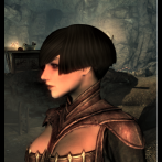
My 2 cents: It's a very handsome design, and one that I personally would like to see looking a bit more grunged up and desaturated, so the textures can really tell the story of the outfit's history, I guess. Scuffs on the leather, weathering around the tooling, a less rich red. The breastplate is really lovely- I can imagine that in a dark tobacco leather as easily as I can see it in its current bronze-y incarnation. Some metal scuffing here and there could be cool- http://lostandtaken.com/gallery/tag/scratched With such a nomadic, Romantic armor design (that's how I see it anyway) , I imagine that scarf being kind of nubby and coarse, with a visible, loose-ish weave, almost Gabbeh like. A raw silk or cotton texture could be cool, if it weren't starchy looking like shantung. In a different direction, some of the vintage book textures here could be interesting as a base: http://lostandtaken.com/blog/2011/10/28/25-deconstructed-vintage-book-textures.html Take my ramblings or leave them, in any case it's a good looking piece of work, RTC.1 point
-
That's the problem with photos, they're just too flat. Add some depth to the pants, scarf and sash with something like this as an overlay. Desaturate it and play with opacity levels to fade it out, using different levels for pants vs. sash/scarf. Play with different blends. Also, lower the specularity on the sash and scarf, they're (to me anyway) too shiny. Unless you want a satiny look. The leather could use some scratches to give it a more worn out look. And bump up your normals maps.1 point