
DOWNLOAD MODS
Are you looking for something shiny for your load order? We have many exclusive mods and resources you won't find anywhere else. Start your search now...

LEARN MODDING
Ready to try your hand at making your own mod creations? Visit the Enclave, the original ES/FO modding school, and learn the tricks of the trade from veteran modders...

JOIN THE ALLIANCE
Membership is free and registering unlocks image galleries, project hosting, live chat, unlimited downloads, & more...


Artisanix
-
Posts
210 -
Joined
-
Last visited
-
Days Won
8
Content Type
Profiles
Forums
Downloads
Tutorials
Gallery
Store
Events
Everything posted by Artisanix
-
From the album: Artisanix' Garage
-
From the album: Artisanix' Garage
-
From the album: Artisanix' Garage
-
testing new painting and its collision ;p
Artisanix commented on Artisanix's gallery image in Member Gallery
 Indeed Willie. Finally figured out how to export correct in size primitive collision shapes...
 -
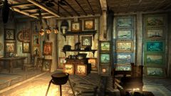
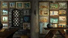
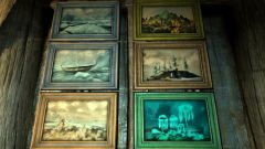
![painting anyone? ;]](https://tesalliance.org/forums/uploads/1336065920/sml_gallery_18597_323_332195.jpg) That's only one cookie there, lilith. And the price is like one painting = one cookie. You need to fetch nineteen more for all of the goodies here Yes, Arthmoor. Pure and clean resouce from the start. And that's only the beginning (only 2/3 of middle class paintings are here). Need to make some more... and items, and tools, and clutter, and pieces, and components, and elements...
That's only one cookie there, lilith. And the price is like one painting = one cookie. You need to fetch nineteen more for all of the goodies here Yes, Arthmoor. Pure and clean resouce from the start. And that's only the beginning (only 2/3 of middle class paintings are here). Need to make some more... and items, and tools, and clutter, and pieces, and components, and elements... -
From the album: Artisanix' Garage
-
From the album: Artisanix' Garage
-
From the album: Artisanix' Garage
-
Skyrim Modder's Resources - What would you like to see?
Artisanix replied to InsanitySorrow's topic in Skyrim Mods
Deal with it! You just opened the Pandora's Box -
Always use this page as reference while scripting: http://www.creationkit.com/Category:Papyrus There you can see that GetFactionRank is a funcion that is a member of Actor script, and you defined Loki as ObjectReference so it won't work. Define him as Actor instead. The same with CurrentFollowerFaction - it means nothing to the Papyrus until it is properly declared. You need to use: Faction Property CurrentFollowerFaction Auto somewhere in your code and auto-fill this property...
-
In case of the swords it usually goes like this - in Unwrap UVW modifier select the whole blade then flatten mapping, then select grip and flatten mapping, select hilt, flatten mapping, and so on. And try different face angle thresholds, etc. and of course use checker pattern as it is very helpul here. Sometimes you may want to even check those other buttons like planar, box, cylinder, etc. and manipulate their gizmos and other settings there...
-
![New cloud textures ;]](https://tesalliance.org/forums/uploads/1334292853/sml_gallery_18597_323_213094.jpg)
From the album: Artisanix' Garage
-
Before you start creating UVW map you may want to review your final model - try Welder modifier (it merges vertices that are very close together), and Optimize modifier (may reduce number of vertices and faces without changing the geometry much)
-
most of the time - no simplicity of UV map has less in common with complexity of the mesh itself than with actual work of 3D artist in other words, no matter how complex mesh you created, the responsibility for creation of relatively simple UV map is all yours :] if you can't create simple UV map it mostly indicates that you have no required knowlege yet how to do so (means: not enough practice with these things)
-
That's waaaay too many still. Look at original weapons in NifSkope, most of them usually have around 10 pieces only on UV map. Having so many scattered pieces influences two things: a) it won't be possible to put many distinctive details on object's surface because of small amounts of space everywhere b) texturing it properly will be hell of a pain, as it will be almost impossible* to make seamless connections between those disconnected pieces (* at least not worth any of your preciouss time at all).
-
If you experience crashes during UVW mapping, check what renderer you use, if it's DX10 change it immediatelly to DX9, as it is buggy as hell, at least in 2010 version. As for tutorial about UVW maps I posted the link to one here in this thread.
-
 What a mess there ;D I presume you use 3ds max, so do yourself a favor and make couple of things: don't make maps for the whole sword at once - first select part of your sword (eg. all polygons of the blade) and use flatten mapping, but remember to increase Face Angle Threshold to something higher than default (eg. 90, or even 180) this way all those separate polygons will be merged nicely into copule of pieces instead of a thousand ;]
 -
Good article about Paths in Photoshop. Quite useful if you want to design some ornaments. http://www.smashingmagazine.com/2009/08/18/mastering-photoshop-with-paths/
-
[How to Paint] Paintings, Canvases, Sketches, etc.
Artisanix replied to Artisanix's topic in Study Hall
If I understand correctly you have smudge layer on top and sketch on bottom? Well, it should be otherwise :] Just move the layers to correct positions. At the bottom is the layer you smudge, and at the top layer with sketch. And then you can set sketch layer blending mode to something different than normal (multiply works good) and then play with layer opacity when the effect is too strong. Here are GIMP blending modes. -
[How to Paint] Paintings, Canvases, Sketches, etc.
Artisanix replied to Artisanix's topic in Study Hall
I know that old habits sometimes die hard, so you may want to stick with Trollf if you like, I don't mind ;] As for the starting material I agree that it all depends on particular screenshot. In Willie's case the painting is very dark, so you can hardly notice what's really going on there as far as only the texture is concerned, though it may look better in game. Anyway it makes a nice composition with the frame, and as a "background" painting* does the job well (* I mean that's it's more like one of those clutter items and provides additional details to the interior as a whole, and not being the prominent feature by itself at the same time). And good that you posted the link to that painting of yours, Tam. As in this case we can discuss a canvas-frame composition ;] Actullay here it's usually one of those scenarios: 1. discreet frame + "generic" canvas = the two make one object (like in Willie's example, where both these things are quite and equally dark) 2. discreet simple frame + very nice canvas = here clearly one can see who's the boss of these two ;] 3. very detailed or complex frame + "generic" canvas = frame steals the show, painting is no more than just some backgorund... 4. detailed/complex frame + nice canvas = tough decision, it's very hard to focus on one element, as everything "fights" for our attention... and the last scenario is present in your "shadowgreen" example ;] You have interesting picture there, but at the same time its frame is quite bright with very vivid colour and with plenty of details - and this makes it harder to "fully focus" on the canvas itself. Here's a quick example how your painting looks with darkened frame and its shifted colour (well, those shadowgreen vistas deserve to be better exposed, don't you think?) ;] -> -
[How to Paint] Paintings, Canvases, Sketches, etc.
Artisanix replied to Artisanix's topic in Study Hall
Well, I may see my "mistake" in thread's name... it should be rather not [how to make] but [how to "paint"] instead ;-] Both techniques posted here (Willie's and IS' tutorial) fit into fully automated methods of paintings creation. And this is good primarily if you either have dozens of screenshots and want quickly to convert them to "paintings", or you are simply happy with everything your throw there into the frame ;-] (in other words if you just discovered texturing and how fun this process really may be) While such "photos" may be acceptable from our point of view, but on the other hand, just think about the people of Tamriel ;] How they could achieve such photorealistic prints of their surroundings? Some sophisticated Dwemer Digital Cameras perhaps? ;D Anyway, what I would like to point here, is that there are some other ways few clicks of the mouse away that being relatively easy to use, can "personalize" each painting and make it more unique, as it was made by a creature rather than a robot ;-] And here I made a quick example (less than 10 minutes overall) and messed with Willie's painting a bit punching it with smudge tool (I can only hope he won't mind that I used this as an example). It is not necessarily a better result but definitely a different outcome. And may put these things in perspective for some of you and maybe push towards searching your own simple ways of making the paintings slightly less "artificial" ;-] -
Let's say I somehow "promised" to create such a thread for Tamira ;] Anyway, have no idea whether it's a good section to place it here... This thread is for sharing various techniques which can be used to make decent textures for paintings, canvases or sketches for your mods. To make all these things as simple as possible let's start with how I see this: Three methods in which someone can make the good texture for any painting: I. fully automated II. semi automated III. fully "manual" Ad.I - the simplest way is to use two layers, one with canvas texture, and one with actual screenshot (picture), then use various blending modes to mix these two layers together pros: the quickest and easiest way cons: final result looks far more like photo than painting Ad.III - here are various techniques that may use smudge (in case of converting photos to paintings) or various brushes to paint on different layers with different blend modes pros: these are really outstanding in the end cons: may take many hours of even days to complete Ad. II - the way I woul like to discuss a bit more, as this is a method I usually prefer recently as far as making paintings for games is concerned pros: relatively fast (usually no more than 10 minutes for painting) cons: not as outstanding as fully manual approach, but far better (imho) than any automated methods as it gives more satisfaction and no painting is the same simplified workflow: 1. first layer is with texture of the canvas 2. second layer is with actual screenshot (usually lightened when actual "painting" with smudge occurs) 3. third layer is a duplicate of the screenshot (converted to "sketch", for recovering back some of those lost details) Ad.1 here I usually desaturete canvas texture if it has any colour Ad.2 usually screenshots need to have reduced contrast, in PS it can be done with Shadows/Highlights adjustment, it is the best when picture doesn't have any extensive black areas after this I "paint" on the whole picture with very short strokes with smudge tool at low strength then I use one of the blend modes to mix this layer with canvas texture below Ad.3 this is the duplicate of the original screenshots, and with adjusted shadows/highlights too (pic can't be too dark) and then I convert it to "sketch" with various techniques (photocopy filter for example) finally mix this with layers below with one of the blend modes and various opacity All this shown at sample picture with one of possible workflows: here. Questions? Opinions? Your methods?
-
One of the most fundamental questions. Do you test your mod on clean saves?
-
Quite a nice read. It's good to see more human beings interested in texturing, as it opens limitless posibilities for new mods. And I'm wondering, maybe it's time for me to participate in such classes as well? ;]
-
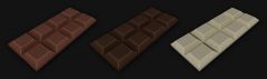 No name chocolate? It should have the logo of its maker engraved on its surface ;]